Repository navigation
fix: additional increase in button size due to #213 - #214
1502shivam-singh wants to merge 4 commits into
Conversation


 1502shivam-singh
changed the title

|
cc @qier222 to take a look |

|
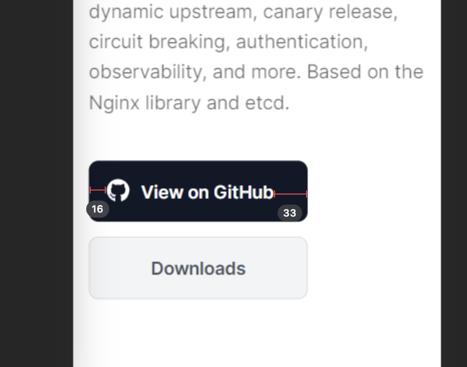
🤔 |

|
Oe Oe Oe! 🤣🤣 Run down your scales on this one, then 😅 |


|
|
|
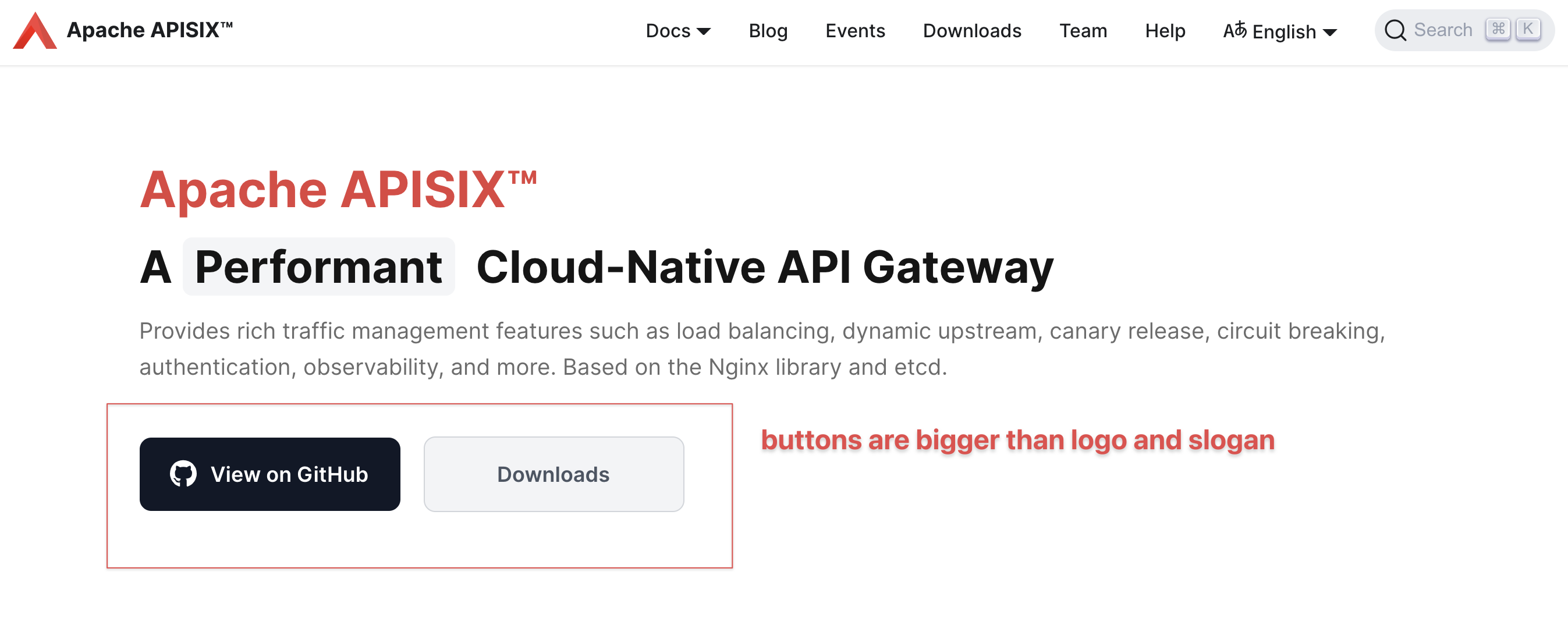
Didn't get the statement "buttons are bigger than logo and slogan" 😕. By slogan do you mean "A...Gateway" ? |
|
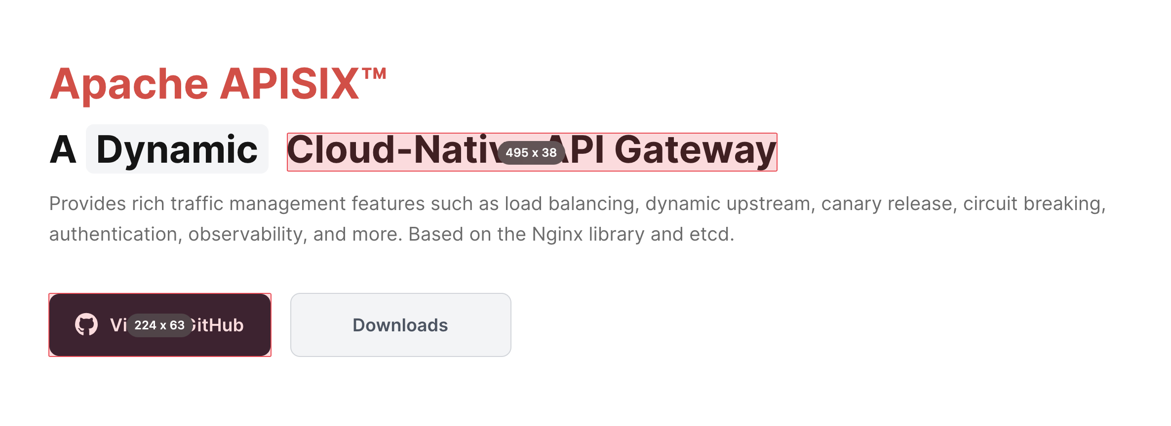
The height of the "View on GitHub" button is higher than the "A Dynamic Cloud-Native API Gateway" text, and the "View on GitHub" is almost black, attract way too much attention than the slogan text and brand text.
Here is some example how other designers handle slogan and primary button.
|



|
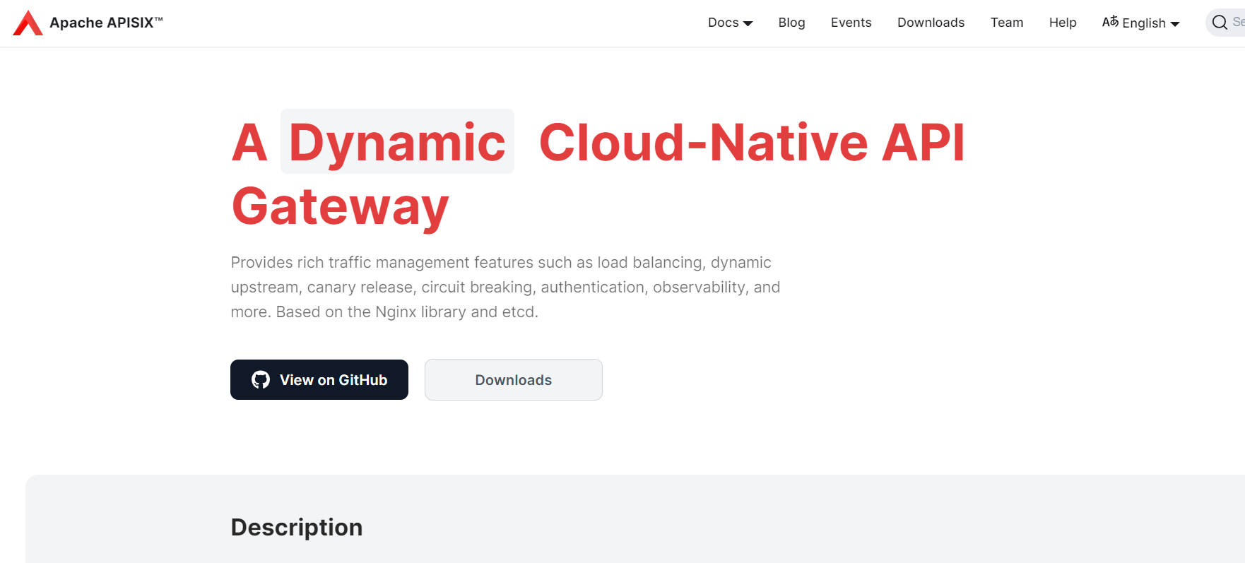
How about this (initially I was trying not to change too much of the original design as he/she must have had their thoughts behind it, but now I feel you are fine with it. So here we go😄 )
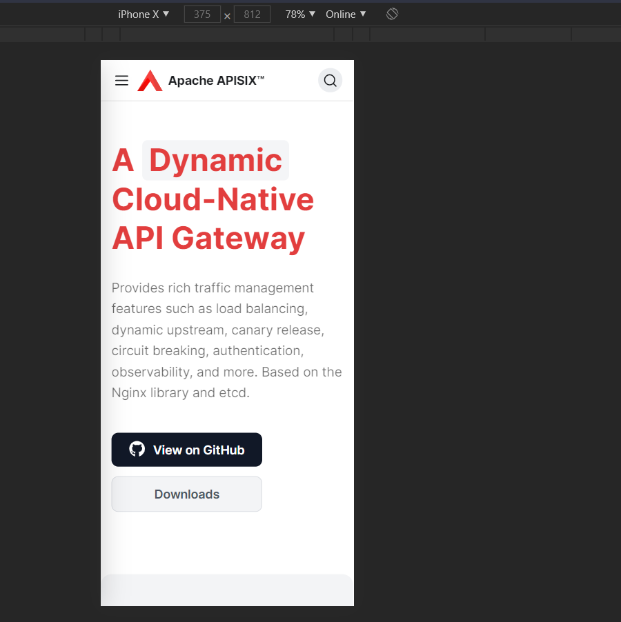
I removed the Apisix title, as it looked repeated (written in navbar too), Increased the font size for highest focus and changed its color to match the color scheme. Made the text wrap, as the sub head copywriting is too long, reader might lose his eye position in the middle. Also made the buttons a little thinner, for best results On mobile -
|
|
Not sure if those two buttons' position is good to view 🤔 Others look good to me |

|
BTW, I noticed that the picture on our homepage is hard to read (a little small) 🤔
|

|
Yup, your orgs website is failing on this point of accessibility. |
|
@juzhiyuan what's your feedback to these edits and the mobile screenshot in this one
|


|
Wait a bit, just let me push these changes to the branch |
|
Guys have encountered a problem while pushing to this branch. Created a new pull request PR for this integration. Please merge that pull request after reviewing. @juzhiyuan @gxthrj |
Sorry for the slow response. I designed this page, I was planning to make the logo on the navbar hidden when the logo in the hero section is visible, but I haven't done this. I think you can remove the logo in the hero section now. The "View on GitHub" and "Downloads" buttons are center-aligned inside and left-aligned outside, looks weird to me, I still think make these buttons full-screen wide is a better option. Maybe we can center align the slogan on mobile devices? |
|
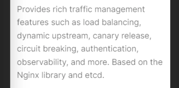
Also, how about making this part align from two sides? |
|
How about this?
|

|
+1 Red & Black (keywords) would be more clear for users 🤔 |
|
@1502shivam-singh What's your opinion? |
|
@qier222 This one looks good to me.
For the rest, you designed the page previously, and the buttons were left-aligned previously too with text-centered, so you must have had some thought behind it then. I am just following that flow, what I feel your thought would be is to keep the buttons left aligned because the section itself is left-aligned, the best example of a similar website-hero-section is the stripe website -
I guess we should first decide on one layout for the hero, then extend further on it. Full-width CTA buttons I have discussed earlier too for left-aligned sections. This I agree on that a center-aligned hero section would support full-width buttons better Github website is an example, but they also have it because one field requires an email for which it's full width and the button below it is full width to match the field width for uniformity. Also, something I noticed is when this section is center aligned, the animating text breaks the layout every transition (Try it, you will see), it's just noisy seeing that "A" move around 😣. |

|
Looks good on my phone🤔 |

@juzhiyuan did you mean this -
Justify alignment can mess up things sometimes. 😅 |
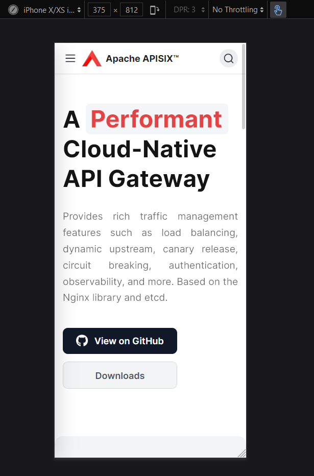
I don't have any issue with keeping the buttons, not full width. It's just that we have to decide on one thing and follow it, not deviate from it. You designed the website previously and I was just respecting your judgment 😅. If all agree, and this is final then I am fine with it completely 😄. |
|
|

|
Also, sometimes we should not just focus only on making the stuff "look good". Don't get me wrong, beautiful UI is Paramount, but I feel we should hit the middle ground between top-class UI and top-class UX. The reason I gave for not to put full-width buttons is a UX focussed decision, mistouch is possible on full-width buttons, (Especially when you have a phone with a bad touch screen, as my brother's phone 😒, and you just don't change it for some weird reason and you code too. This leads to a bad UX for that person) and more chances when you have 2 of them. We should try to avoid these issues, especially when they feel minimal. This is one reason why we don't see full-width buttons more often, if used they have some special reason for usage. Also, the fact that we have to focus on button widths to make our hero section look good, is an indicator that our hero section lacks a focal point. |
I get your point, but I don't think use full-width buttons will have a large impact on UX. Your example is your brother's phone has a bad touch screen, it does not make much sense to me, is the phone make the UX worst, not the application. Email app has an email list, and every list item is clickable. If a phone with a bad screen can cause mistouch the full-width buttons on a website, then it definitely can cause mistouch on an email list or any clickable list, does it mean we should stop using clickable list? |
|
No no no, you are getting my point wrong here, I am not saying it that we should stop using clickable lists or surface that can click and we have to scroll over them. I am saying that if we can solve the problem for that particular person easily without much loss (phone has bad touch) then why not do it? The email list example is actually a problem for that user, but we can't do much about it as its designed already, and also this doesn't mean the app has bad UX. There is a simple solution for the above problem, give user space with non-clickable elements, and this solution doesn't really hurt the structure of the hero section. Sure, users can have the worst phones, with the worst problems and we will surely not be able to solve all of them. "But if we can solve the problems that are visible to us then why not solve them?" This is my point |
|
Also, if I am right you have issue that the button is left aligned but the text is centered.
then I have a solution that can serve both of ours's needs. |
|
Extra top margin to separate the left aligned slogan and subtitle with the centered buttons. Keeping them distant will make the hero section look better, as then alignment-flow wouldn't be a problem (both sections are separate now). |
|
In my opinion, use full-width buttons in this hero section will improve 20% of UI, not use full-width buttons will improve 3% of UX, I won't trade 20% UI improvement for 3% UX improvement. |
Those numbers are actually pretty ambiguous and biased towards your case. For some user they can be reversed too. @qier222 By the way did you try my centered button solution above with some top margin. As I said, it solves of both ours's problems. Still if you insist, so much I don't really have much of objection with full-width CTA, it's your call. |
docs: added dashboard (apache#221)

fix: pull request in place of apache#214 (apache#222)

fix: changes to title style on landing page and doc addition

Co-authored-by: Amit Wani <amit.wani@cognizant.com>

docs: added dashboard (apache#225)

docs: added blog `Get Front-End Test Coverage with Cypress`  (apache#227)

fix: Wrong doc url (apache#231)

fix: some url path can't replace by absolute url path (apache#237)

Co-authored-by: coolsoul <coolsoul0551@qq.com>
Co-authored-by: 琚致远 <juzhiyuan@apache.org>

feat: support edit this page & update styles (apache#235)

chore: fix release guide since doc layout changed (apache#238)

docs: added Integrate with Projects documentations (apache#234)

Co-authored-by: 琚致远 <juzhiyuan@apache.org>

added latest styles

feat: algolia docSearch apache#226 (apache#241)

docs: use getting-started for ingress-controller (apache#242)

feat: upgrade APISIX version (apache#244)

fix: add <!--truncate--> to the blog markdown files apache#240 (apache#247)

fix: rectify the index doc page for apisix ingress controller (apache#249)

fix: fix the version number in mobile size overflow (apache#245)

fix: apache#220 (apache#239)

docs: added event about releasing APISIX 2.4 (apache#248)

docs: fixed broken powered-by.md link (apache#251)

docs: update navbar for apisix (apache#252)

fix: improved the description for users to join slack (apache#253)

chore: Add new committer jinchen in committer list (apache#254)

docs: add docs for ingress 0.4.0 (apache#258)

* docs: add docs for ingress 0.4.0

* docs: modify ingress downloads

* fix: lint

fix: update sync-docs.js (apache#257)

feat: improve documents synchronize (apache#262)

feat: sync user wall data (apache#260)

feat: support toggle sidebar (apache#269)

chore: move Chao Zhang from Committers to PMCs (apache#267)

feat: apache#216 add helm-chart project (apache#273)

fix: add a bundle of good first issues links to homepage  (apache#274)

feat: support apisix-docker (apache#275)

feat: broken link checker script (apache#263)

Co-authored-by: 琚致远 <juzhiyuan@apache.org>

feat: apache#266 speed up static file (apache#270)

feat: upgrade APISIX Dashboard version (apache#276)

feat: support to load other projects (apache#277)

chore(deps): bump peaceiris/actions-gh-pages from v3 to v3.8.0 (apache#271)

Signed-off-by: dependabot[bot] <support@github.com>
Co-authored-by: dependabot[bot] <49699333+dependabot[bot]@users.noreply.github.com>

chore: upgrade APISIX 2.5 (apache#279)

chore: remove downloads for docker & helm chart (apache#284)

feat: APISIX 2.5 event (apache#283)

docs: added a new blog "Traffic Split in Apache APISIX Ingress Controller" (apache#286)

chore: support dark mode and switch (apache#289)

chore: support hide navbar on scroll down (apache#290)

fix: page not found for apisix docker and apisix helm chart (apache#282)

Co-authored-by: Ayush das <ayush24das@gmail.com>

fix: add truncate and source to newly added blog (apache#296)

* update traffic-split-in-ingress-controller.md

* Update website/blog/2021-03-27-traffic-split-in-apache-apisix-ingress-controller.md

Co-authored-by: John Bampton <jbampton@users.noreply.github.com>

Co-authored-by: John Bampton <jbampton@users.noreply.github.com>

fix: disable version switch button in sidebar, as website doesn't support it (apache#299)

fix: padding to arrow inside collapse sidebar button, and fit button to sidebar width (apache#300)

fix: darkMode enhanced (apache#297)

chore: release ingress controller 0.5.0 (apache#305)

* chore: release ingress controller 0.5.0

* feat: add event

fix: broken link in  release guide (apache#306)

docs: update the architecture diagram (apache#309)

chore: add alpha channel to showcase image for dark mode (apache#303)

Signed-off-by: yiyiyimu <wosoyoung@gmail.com>

chore: Fix GitHub-icon sizes in team page  (apache#313)

docs: update logo wall (apache#315)

chore: upgrade APISIX Dashboard version to 2.6 (apache#317)

docs: update logo wall (apache#316)

docs: update download link (apache#320)

docs: update integration page (apache#327)

chore: Test Docusaurus webpack 5 support (apache#318)

feat: added last updated time (apache#331)

docs: fix broken links in Run Ingress on Amazon EKS blog (apache#333)

update docusaurus.config.json (apache#334)

feat: darkmode added to download-dropdown (apache#336)

Co-authored-by: 琚致远 <juzhiyuan@apache.org>

chore(deps): bump actions/setup-python from 2 to 2.2.2 (apache#339)

Signed-off-by: dependabot[bot] <support@github.com>

chore(deps): bump actions/checkout from 2 to 2.3.4 (apache#337)

Signed-off-by: dependabot[bot] <support@github.com>

chore(deps): bump actions/setup-node from 2 to 2.1.5 (apache#338)

Co-authored-by: dependabot[bot] <49699333+dependabot[bot]@users.noreply.github.com>

release ingress 0.6.0 (apache#343)

docs: include  Helm charts and Docker to documents page (apache#342)

feat: added meta image (apache#345)

squashing: merge history commits on docs and landing page

set max-width attribute to docMainContainer class

set max-width attribute to docMainContainer


Fixes: fixes increase in button size due to pull request #213
Changes:
Removed the padding and margin from global button styles and applied them to local styles of specific buttons
Screenshots of the change:
Button size fix
Added padding to "View on Github" on CTA button, for horizontal alignment.